Cartoon Ted
My Cartoon Style
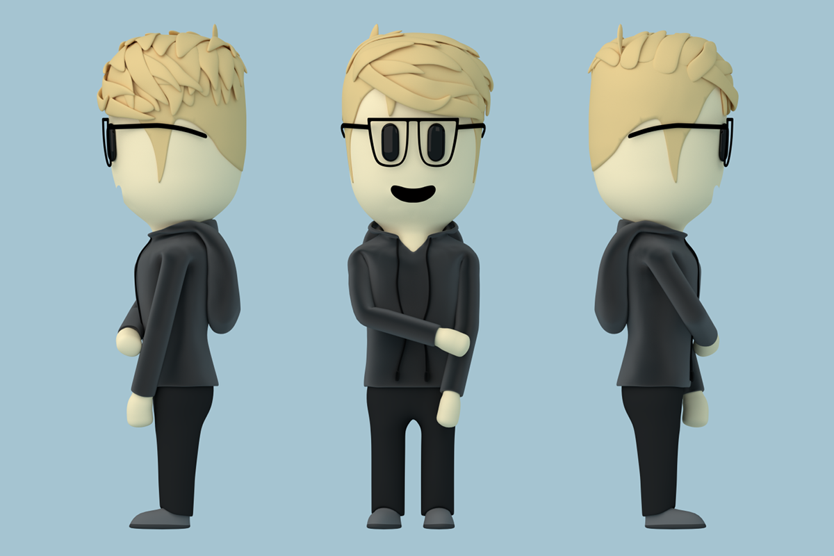
My cartoon style is very simple. It features blobby, humanoid creatures with shiny black, pill-shaped eyes, a ridiculously large head, stubby legs, and little meta-blobs for hands.
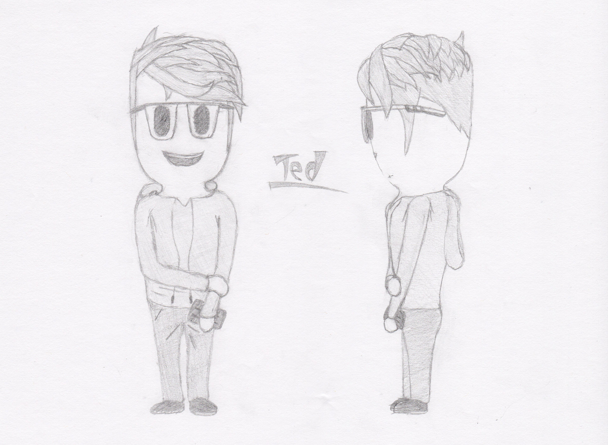
Since my cartoon style is so simple, it doesn't necessarily look like me but rather captures standout features of my outfit like my glasses, skinny jeans, skater shoes, haircut, and how, at the time, I would always wear black.
I started out with front and side views I had sketched out then copied those over to Blender and created my 3D model based on them. While I refined some details, the ultimate goal of this project was to take a two-dimensional sketch of mine and transform it into the 3D space in a way that looks nearly identical. It also took my cartoon style into the third dimension.
Evolution of the Style
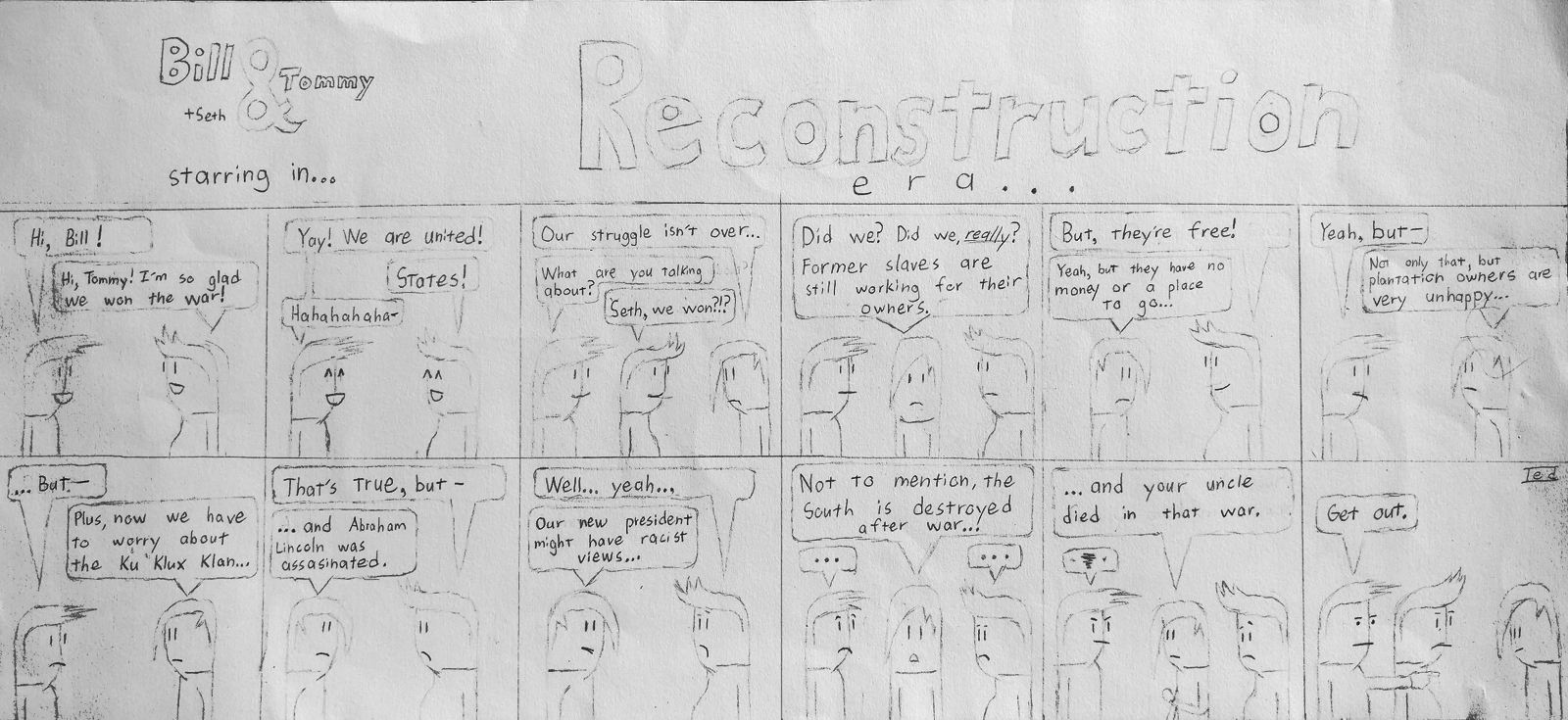
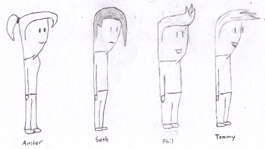
In late 2013, I had a school project in which we were to create a cartoon strip about the Reconstruction Era. I created three characters that I named Bill (who I renamed Phil, not that it matters), Tommy, and Seth. After a few drafts, I had come up with a unique style that I sort of fell in love with and would later use for animation. They ended up looking like cartoon strip characters, who were very simple but very expressive in their facial expressions and gestures. Over the next year, I improved upon this style until it became what it is today.
Animation is Hard, Part One
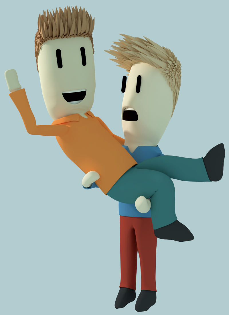
I ended up using this character style and the original characters for an animation (not about the Reconstruction era). It was a big project and I ended up with two scripts, both of which would run at fifteen minutes long. That's a lot to animate, especially considering I had only made one animation before this project (which was very poor, I must add). I ended up creating a small set in Blender along with all four of the main characters, a website (which you can check out here), a draft of a font that I used for the logo, and many sketches I used for planning the animation. I ended up making a trailer for the animation that didn't look too hot. This is what led me to put the project on hold until I improved my animation skills. It's been a few years since then but maybe one day I'll get back into animation.
A few years later, I came back to this old style for a school project but my characters became 2D again.
Animation is Hard, Part Two
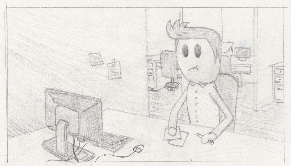
In 2016, I had a “Digital Foundations” class for my Visual Communication minor. For one project, we used Adobe Animate to create a short animation. I decided to take another look at my old cartoon style and make it look a little bit cuter. I made the characters a little shorter and rounder. I then took my sketches to Flash. Time constraints meant I couldn't add all that I wanted to or polish some of the animation (which is a bit rough). However, you can view it here.
A New Generation
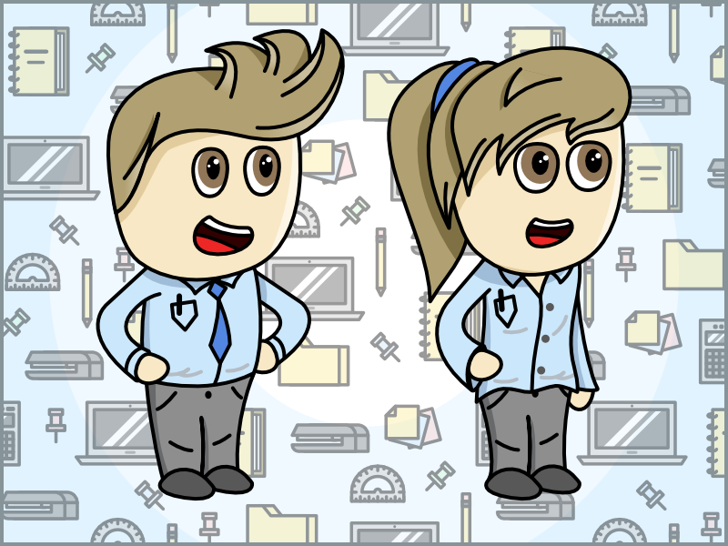
For a while, I was happy with my style in 2D and 3D but now in 2018, I have decided to take my old character style and use it for a game that I plan out in free time. Free time is hard to find but I have plans for a game and my old characters, Phil and Amber, are the main characters. With this game I have finally put an extra layer of polish on my character style. Check it out!