Spoonful of Sugar
A Rebranding Project
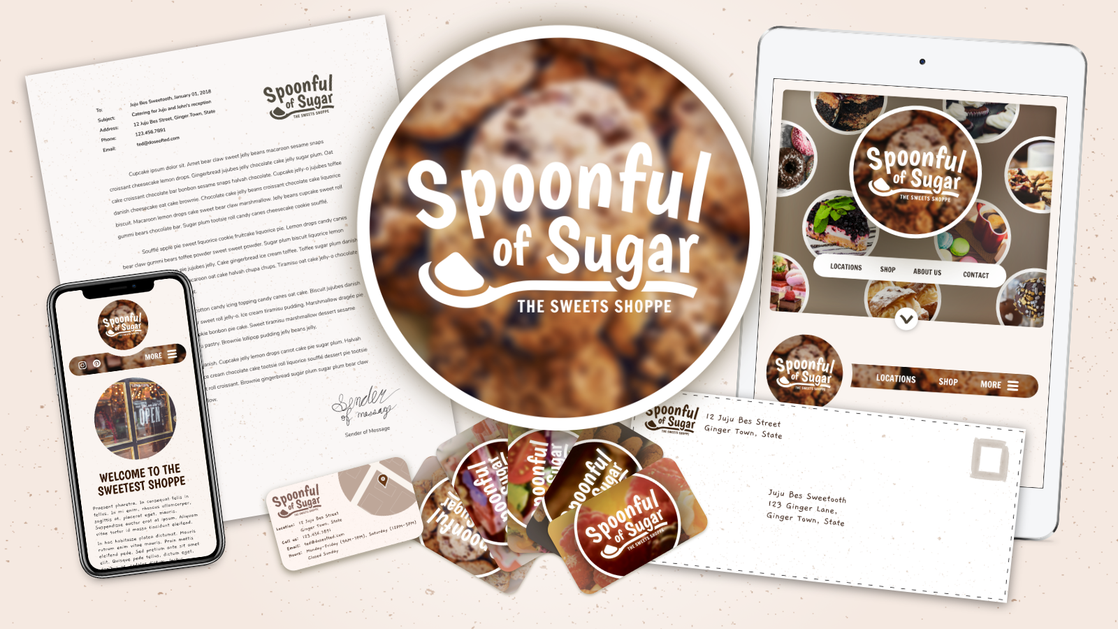
I was very excited for this school project. This was actually one of my last few projects before getting my Visual Communication minor. The goal of this assignment was to create a brand for a real or imagined restaurant and all assets. I created a logo, mockup of a website, business cards, menu, letterhead, envelope design. All of these assets followed a style guide made specifically for the brand of the restaurant. I chose a real restaurant in my hometown to complete this project called Spoonful of Sugar, Sweets and Such. It's a great bakery located in Mount Sterling, Kentucky. While their current branding works (albeit a tad dated), I wanted to experiment with a new look that still captures the feeling of the bakery. You can see the project's progress, including sketches and early drafts here.
When you walk into the bakery, the first thing you notice is, of course, the smell of baked goods but also the atmosphere. It has a very antique feel. The first thing you see is the original, exposed brick underneath brand-new drywall underneath warm, dimmed, decorative light fixtures. The next thing you'll notice is a compilation of big band and 50's music playing softly in the background. You then walk into another room and the music becomes louder and you'll notice lots of local art and the music becomes a little louder. There's a lot to look at around the restaurant while you wait on your order. I wanted to capture this atmosphere in the brand.
I've contacted the bakery to show off the design but didn't hear back. However, I personally like the style and would like to share this online. I've since taken this design and modified it to remove copyrighted images and use of possible trademarks so that I can share this project online, here on my personal website.
Let's Fix the Logo
The first thing I started with was the logo. The logo should be iconic and recognizable at first glance. The old logo used a cursive font and displayed a decorative spoon. While the logo fits the brand, it is a little dated and isn't the easiest to read (logo can be seen at their website). I wanted my logo to have '50's, retro, playful feeling. To help accomplish this, I used a very relaxed and freeform font called Boogaloo and fixed the text to a curve. I also used a color palette consisting of light browns and warm whites. The logo took a lot more time than I anticipated just because of how many revisions I made to fix the shape and form of the logo (in between creating other assets).
First Drafts of Website
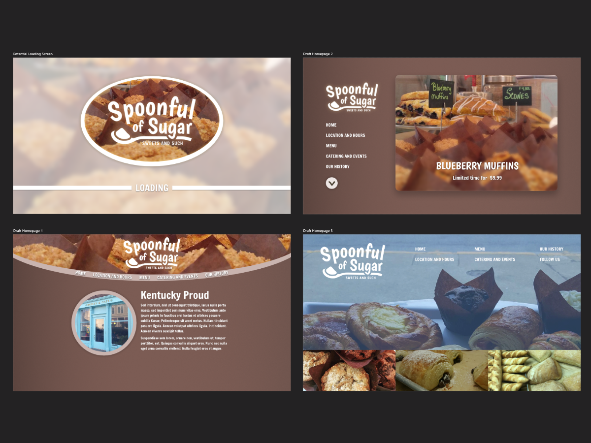
I went through many early drafts to come up with the final website design. While drawing out the first draft, my goal was to keep the retro feel of the restaurant, with a vintage-feeling color palette and a slight curve in navigation that resembled older logos and designs that I found. I had made a few variations of this design and decided not to move forward with the idea after finding that the content I planned on putting on this website would not work well with the layout. My next draft stripped the website down to bare minimum needed design. I used vertical navigation and a large scroller to present content. However, this design wouldn't work because I didn't believe it was interesting enough to get someone's attention. It also didn't match the retro branding that I was aiming for. I tried one more attempt before realizing that I needed to go back to the drawing board.
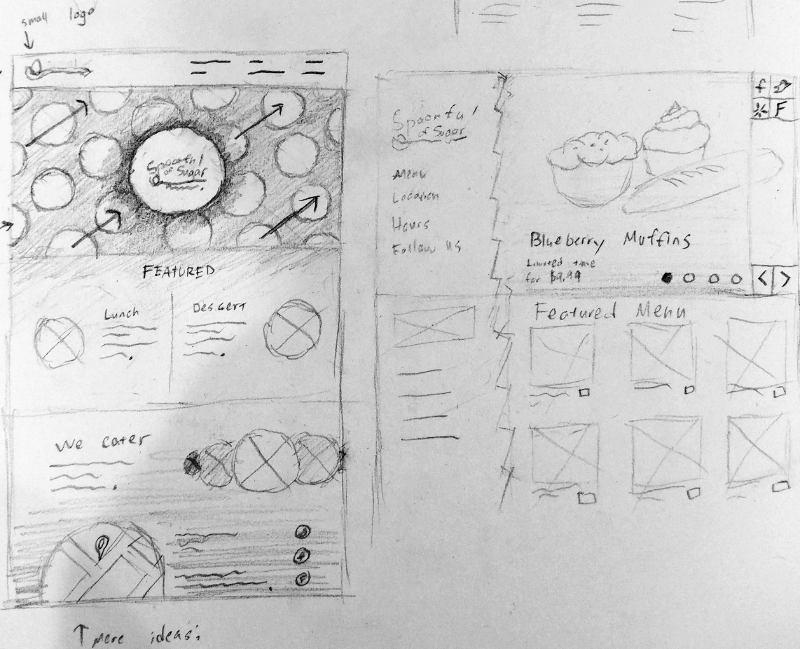
Pencil and paper always allows me to think first about the idea and layout and less about technical aspects like ordering and hierarchy of a document so I started sketching out new website ideas and the sketch on the left is the one I chose. The planned content fit perfectly in this layout and it still maintained a retro feeling that I wanted to keep.
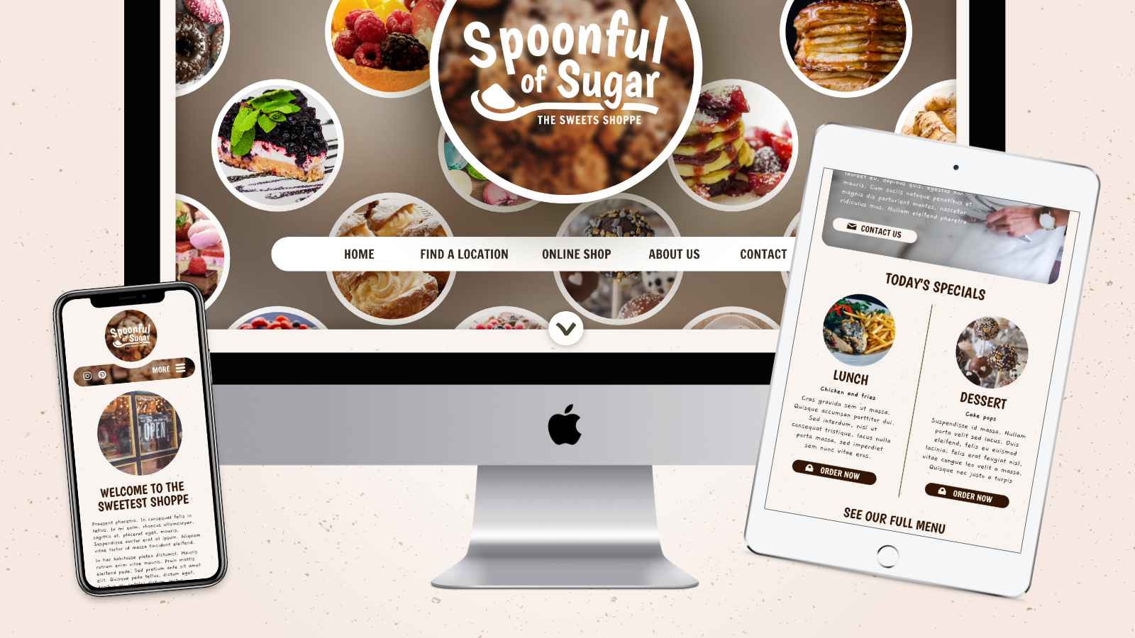
Final Website Mockup
 See Full Website Mockup
I took my sketch of the final website and was convinced that this was the website I would use. I opened up Affinity Designer (my favorite program for anything vector) and started making assets to be used in the final website. I then created a table and mobile version so I knew how these layouts would transform on mobile. I always make sure that whatever website I design in graphic design software, I can convert into a real template and that includes thinking about layout on small and large devices. Since the website is no longer intended for a real bakery, I decided not to make the real website but you can visit all three size variations of the website mockup in your browser by resizing your browser, like a real website.
A Restaurant Needs a Menu
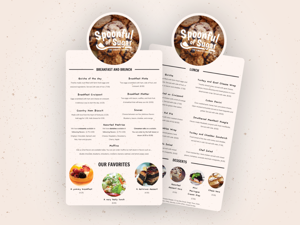
A bakery needs a menu and that menu needs to be organized and easy to read. I've gained a lot of practice making digital experiences but not as much with print design. This project gave me an opportunity to learn best practices when designing print products. I specifically searched for tips regarding menu design and use those ideas to create this menu.
Sweet Branding
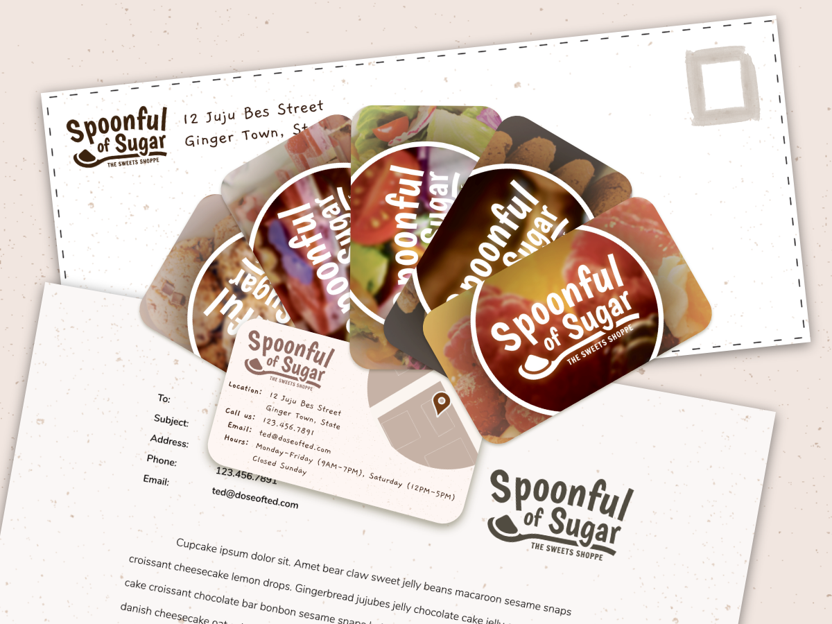
I also created business cards, a letter head, a even a custom envelope for the business as well. These products keep the playful, retro feel but show a different tone. These products are made for billing and getting new business and such deliverables should look professional, and I believe these designs do just that.
Overall, this project was great practice and helped me gain more experience in print design and improve on my UI and UX skills. Since then, I've designed another brand for an imagined restaurant that I call Choix du Chef that's worth checking out.