Choix du Chef
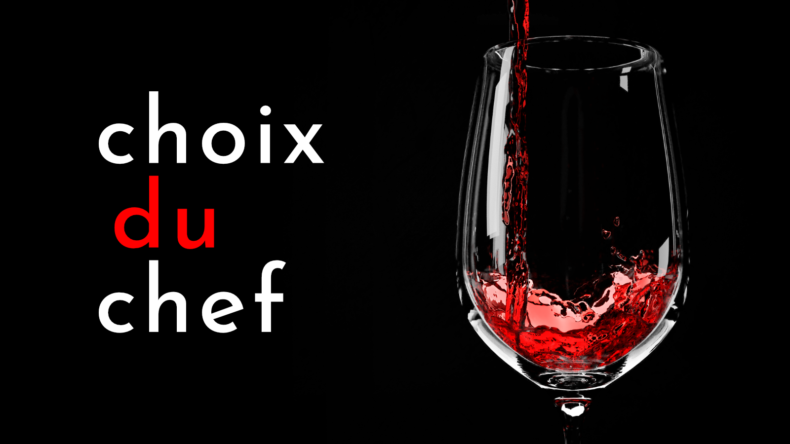
Choix du Chef is the name of the imagined restaurant that I came up with so I could practice creating a brand identity for a high-end establishment… something I've never really tried before. It translates to “Choice of the Chef” and the restaurant revolves around the idea that the head chef chooses a new, delicious, and unique meal each day (of course, with other options available). Basically, it's intended to be fancy-schmancy, five-star restaurant.
Advertising
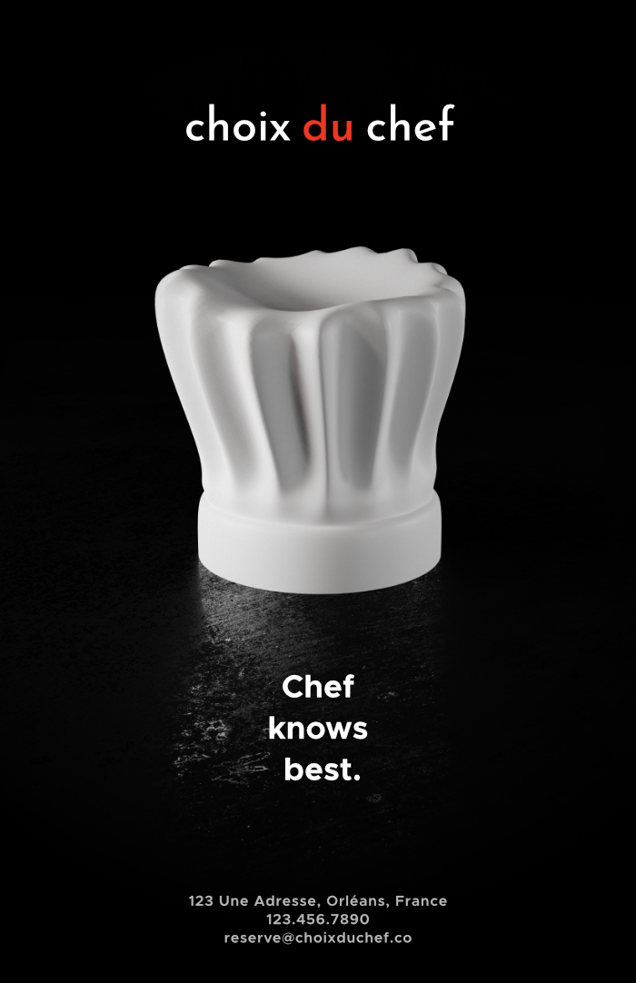
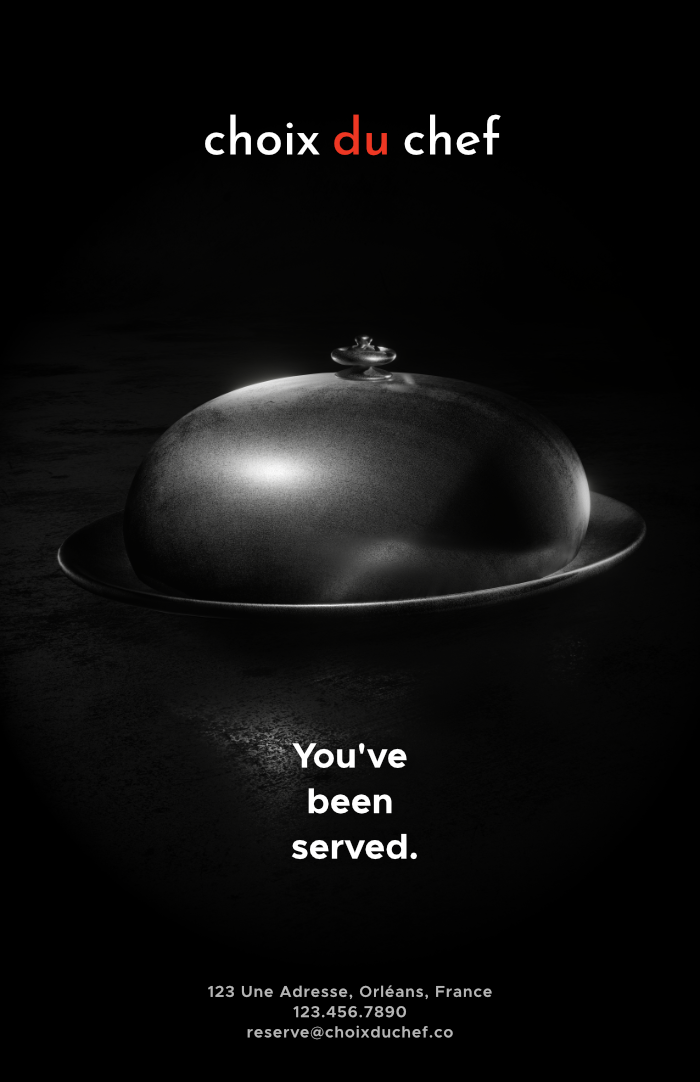
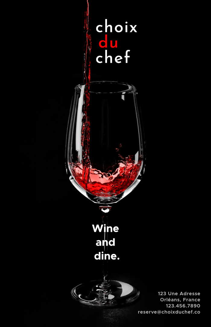
These three posters for the restaurant follow a similar pattern that matches the branding that I had created. There's not many of us who spend much time looking at posters and when we do, we shouldn't have to do any work to find information that we need. These posters follow a format similar a lot of movie posters and put a focus on simplicty with short and quippy phrases. The restaurant retains an air of mystery by not showing much in the way of food or what the restaurant looks like. However, it gets a message across: this place is high-end. The three objects in the posters could all associated with fancier living and the contrast between the objects and the rough background give a feeling of luxury.
All three of these posters were modeled and rendered in Blender. I've been using Blender in some form for years and creating these posters in software (as opposed to photographing each object) saved me both time and money. These posters actually gave me a chance to try Blender's new EEVEE engine which was in alpha release when these were made. Since the renderer still had some bugs and strange visual artifacts at the time, I decided to go back to Cycles for the first and last poster. In fact, since the EEVEE engine is a real-time engine, it wasn't suitable for rendering a wine glass with the reflections and volumetrics involved (a Cycles render took hours). The second poster however, was rendered in EEVEE.
Business Cards and …Takeout?
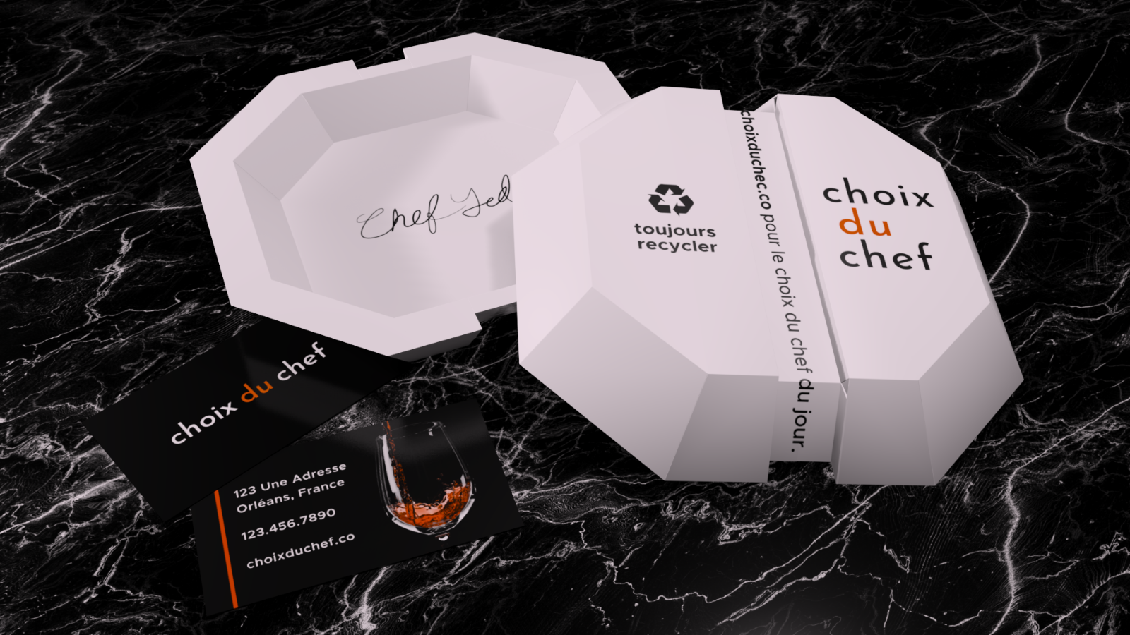
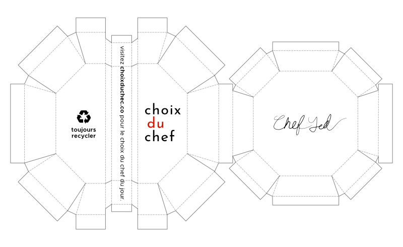
I don't personally think of cheap takeout containers at a fancy restaurant so I made my own. I started out in Blender with the intention of creating a container that can be folded up in a paper form so that I can actually hold it. I started out making a 3D model, exported the 3D UV map, and then took to Affinity Designer where I added the logo and places to cut and fold. I made the container with recycling in mind. Since it's just paper, it can be recycled and it's also easy to hold warm food because of the space between the outside and inside. I eventually printed this out, to see what it would look like. While it looks cool, a takeout container with eight sides is a pain to put together.
A Fine Selection
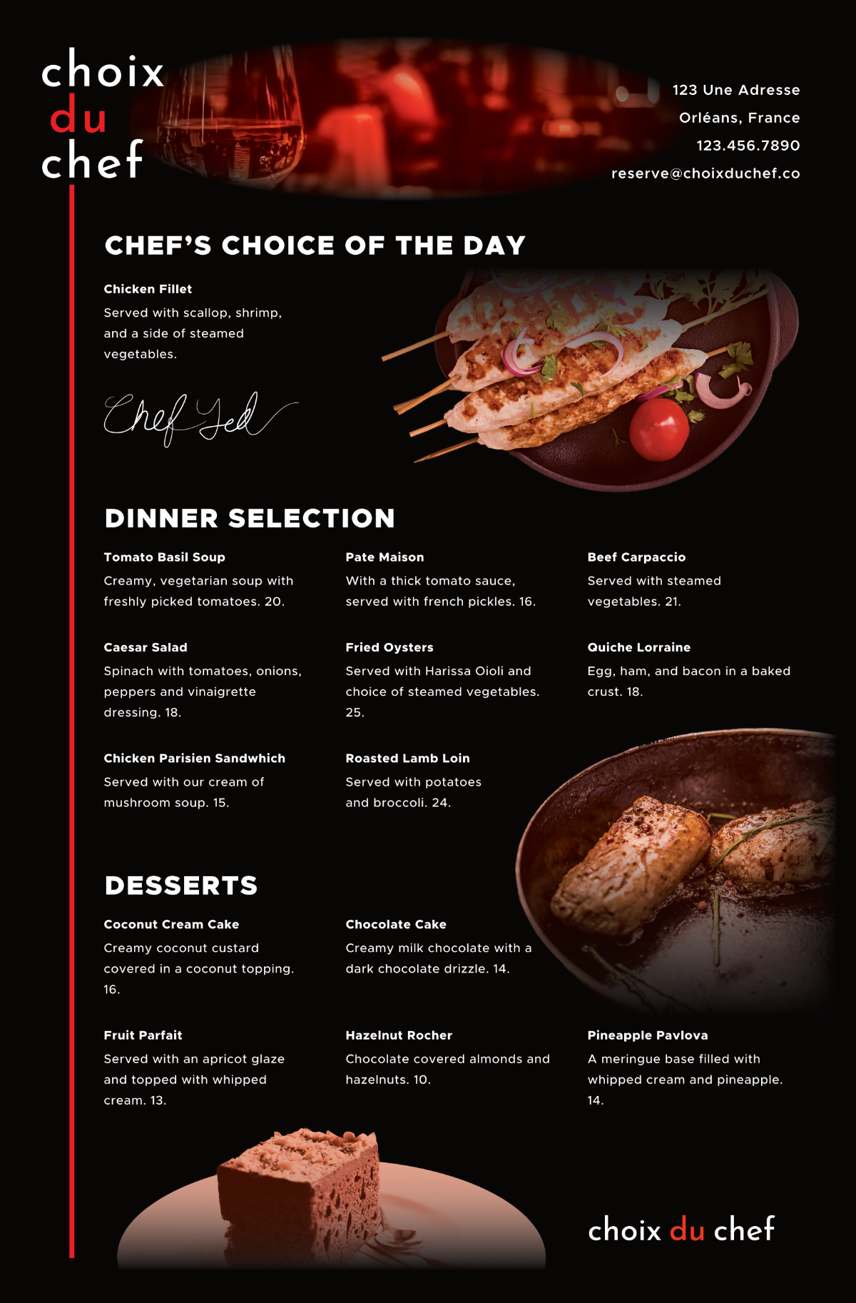
While the idea behind the restaurant is to let the chef choose a new meal each day, sometimes you have something else in mind. So, I created a menu that stuck with the branding of the restaurant that looks slick and keeps it professional. Some of the menu choices aren't so high-end if you take a closer look but the menu at first glance should scream fancy living. This was actually made in a program called Affinity Publisher, which is currently in beta release right now, so this project gave me a great opportunity to learn new and upcoming software.
If you liked this project, check out my other restaurant branding project for an imagined brand “Spoonful of Sugar” here on my site.