Okay Printing

A Solid Website

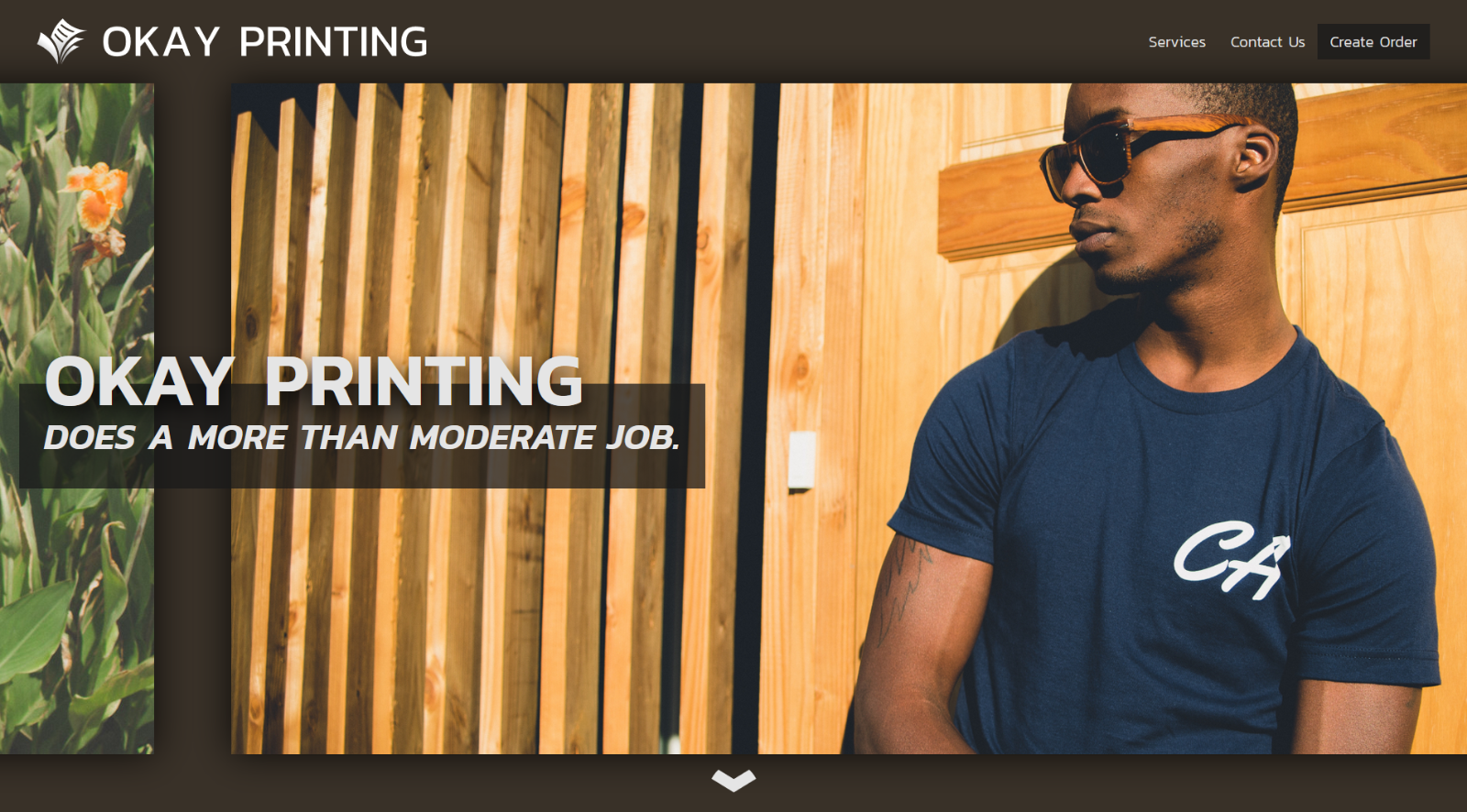
If you browsed the working demonstration of the website, you'll probably notice that it's not your average printing shop website. “A step above mediocrity” isn't usually a selling point for most places of business. I made this website a parody of a printing shop website after the original website (for a non-imagined, real business) had to be ditched. I had already made the website by the time I had realized I wouldn't be able to use it for its original purpose.
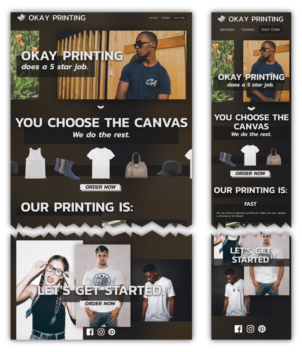
That's okay though, as this will make a great template (once I finish it and post to one of those template websites). If you compare the mock-up to the HTML-ified version, you'll notice that this was once intended to be a real website.
This website was great practice for me. This was the first time I really dove into the world of Node. It's not like I haven't used Node before where convenient but for this project, I had installed Gulp, UglifyJS, Sass, and lots of other smaller modules (many of which really I could have done in terminal, but Node is more fun) to help automate the process.
Update: I entered this website into the ADDYs of Lexington as a student and was recognized with a silver ADDY.
Creation of the Logo

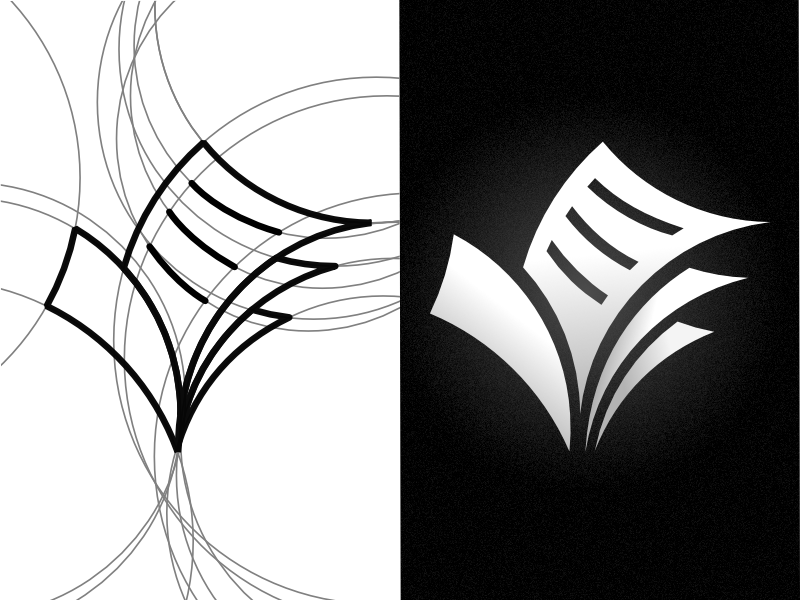
When I decided to re-use this website for another project, I wanted to make a custom logo for an imagined printing place. Since I had already decided on the name “Okay Printing” I came up with ideas involving the OK Gesture and ended up with logos that unintentionally looked identical to other designers' work. So, I combined the OK gesture with a checkmark: still no luck. I thought, “Maybe the gesture is too obvious for the name…” So, I ditched the gesture and decided to combine pieces of paper with a checkmark.
The logo started to look better but looked too rigid. I then decided to restrict myself to using only circles to force a more organic look. I, personally, think it worked.