Bedford and Grove
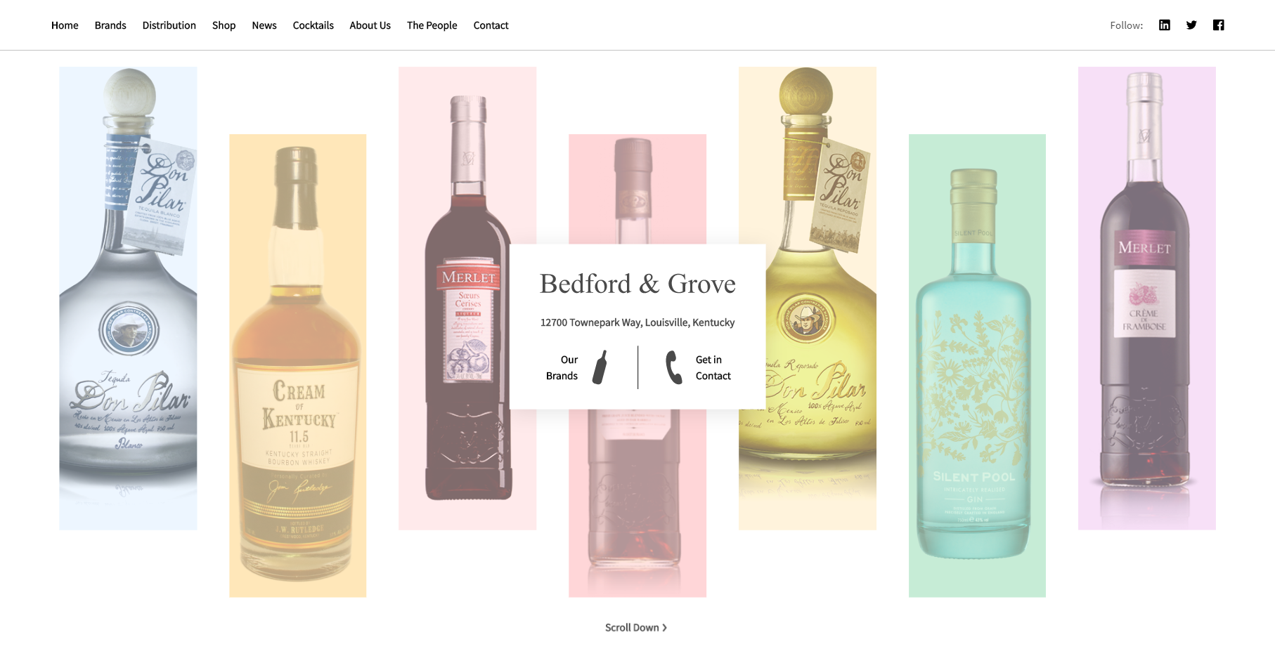
A Completely New Website
The new Bedford & Grove website is a project for a client that I worked on in 2019. With this new website, they are improving their online presence with a list of distributors, news, and an accurate and updated portfolio of spirits and wines with cocktail recipes and awards for each product.
In order to accomplish this, Bedford & Grove came to me looking to completely replace the website. The original website had been in use since about 2012 and while it was a great website for the time, it was starting to look outdated in a world of flat, interactive, and mobile-first design. It also had become cumbersome to edit content meaning that their portfolio of products and news could not be updated easily, leaving content on the website somewhat stale.
When designing this new website, I had three keywords in mind: new, minimalistic, and luxurious. I wanted to make sure that users are always one click away from a contact button, that content is easy to add and update, and that the website was just as easy to use on mobile as on desktop. I have released the first iteration of the website and have more planned such as a shop for various merchandise in the future.
Let's See a Mockup First
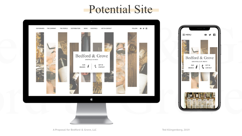
I started this project with a simple proposal with a new home page that puts Bedford & Grove's portfolio first and directs users to important actions on the website. In the center you'll find their logo first. Next, you'll see their address in Louisville (not the intersection of Bedford & Grove, otherwise known as the “Friends” apartment in NY). and a small navigation element (in addition a full navigation at the top). As you scroll down the page, you'll see highlights from their portfolio with a sticky navigation bar that is always in reach.
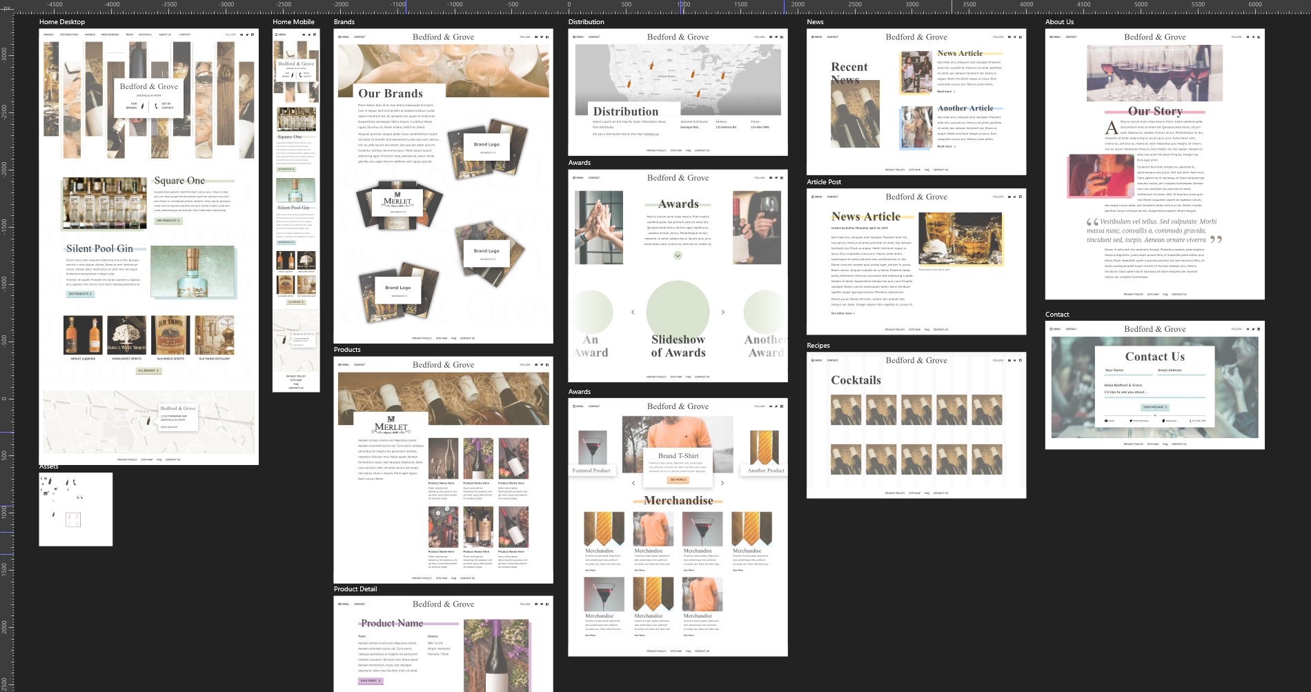
Once the mockup was for the home page was done, I began work on the rest of the website. We had planned to add a shop, news section, a detailed portfolio, a map of distributors, and a few other pages. You'll find the board of mockups above. The goal with these mockups was not to create a totally polished design but to provide something that looks close enough to the website that I had in mind.
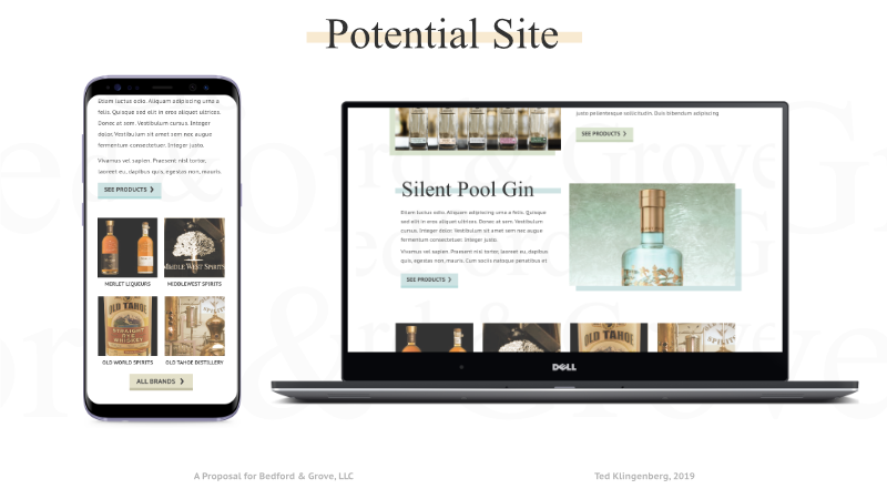
I won't share the entire proposal online but I've left some screenshots of the original home mockup below.

Now to Get Technical
When Stephen (with Bedford & Grove) and I were happy with the final mockups, I began work on developing the actual website. A website like this with a map, news section, configurable list of products, and a shop is not a small task so both the tools and architecture of the web application needed to be solid to avoid wasting any time on mistakes.
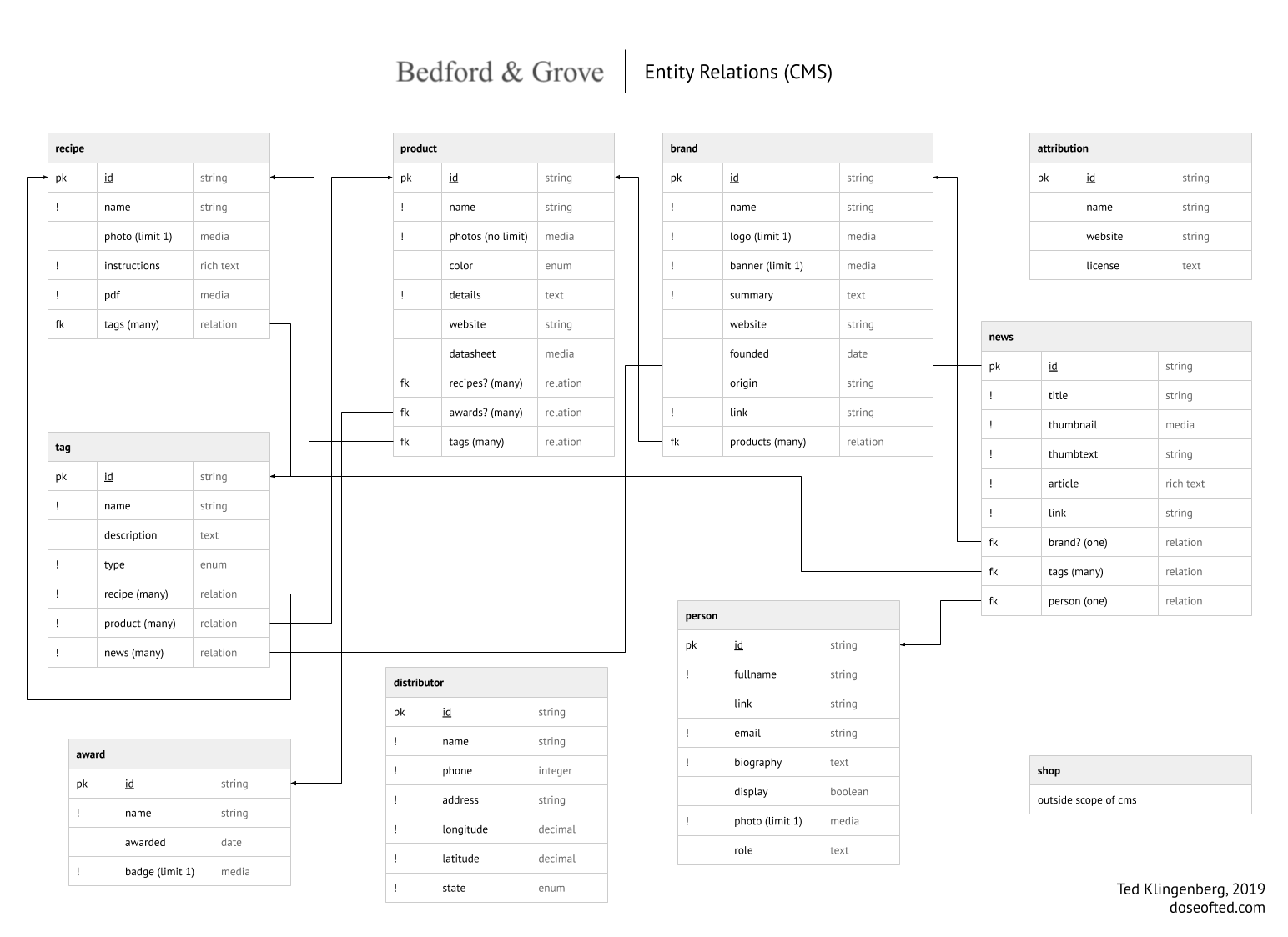
I three tools in mind for this website: Vue, Strapi, and Nunjucks. Without these tools, this website may not have been possible within the timeline we had established. Vue, a UI framework, would allow me to easily define and reuse components across the website. Nunjucks along with an Express server would allow me to easily define routes, and replace parts of the website. Strapi, probably the most important, is an excellent content manager that is incredibly flexible and allowed me to define custom pieces of content within a database and provided an easy-to-use API to access that data. In order to better visualize the relations between content, I created an entity relations diagram (ERD) which allowed me to better understand where content was coming from and how it is related while developing the website.
Launch Day

Once we gained control of the domain and prepared content like products and news, we were able to push out the first iteration of the website. The next iteration is to be released sometime soon with additional pages and potentially a shop.