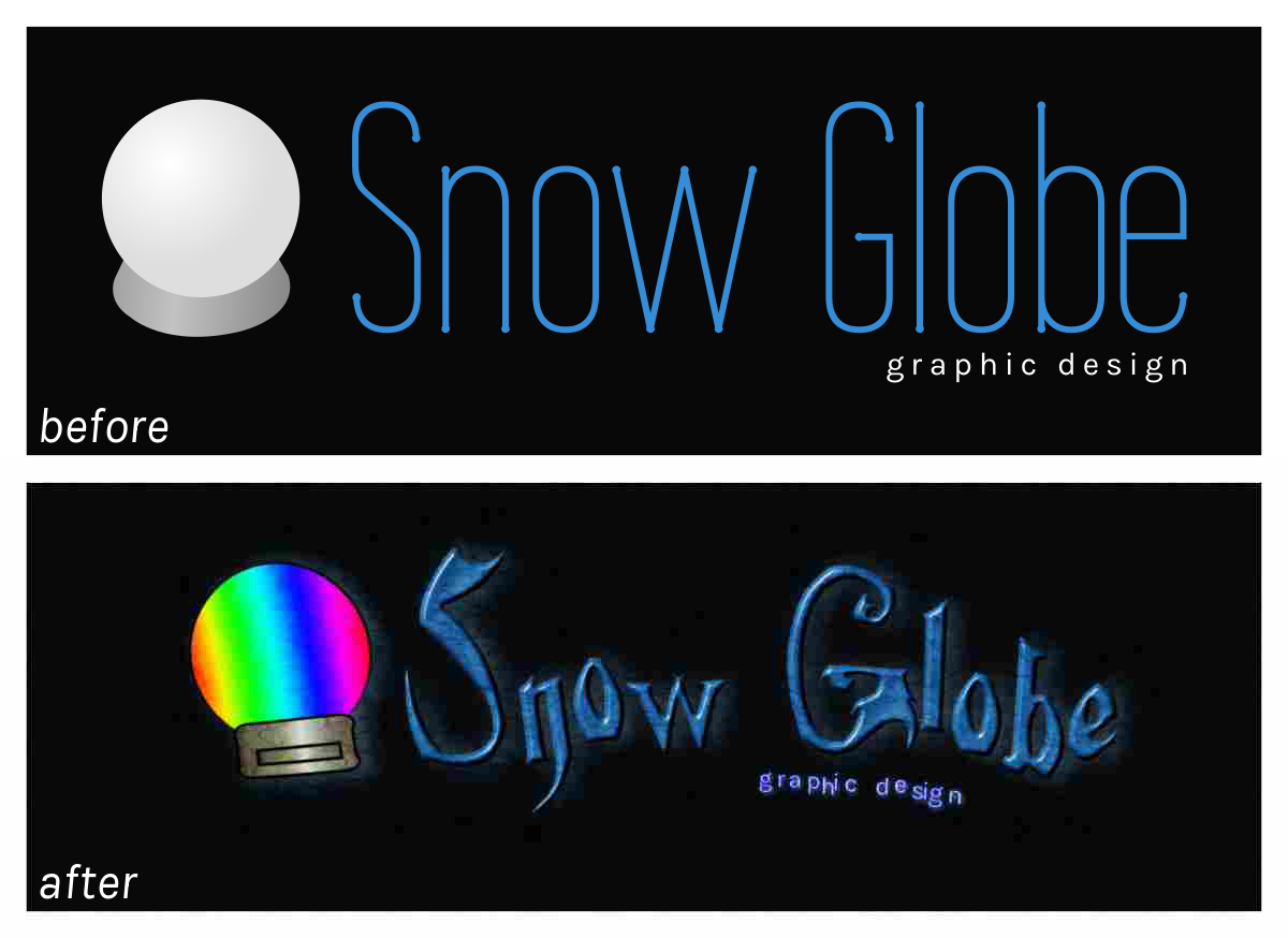
Making the Worst Logo Ever: 2015
posted .
Although it may seem like an odd task, I am going to make the ugliest logo that has and ever will be known to man. Why? Why not. Before we can make such a logo, we first must determine what makes a logo ugly and then use all of those characteristics at once. It may be possible that we create a logo so ugly that it becomes beautiful. Except not really. This logo will, of course, break all graphic design trends of 2015 so far.
For irony, this logo will be for an imaginary graphic design firm. Since it's Winter, we'll call it Snow Globe. No, this process is not in any order. We will also not be using Comic Sans. This is only because I want to stay away from clichés. Let's get started and make something truly ugly.
Wrong Font Choice
You saw this one coming. Some fonts (or typefaces, whatever floats your boat) were not intended to be used. At all. Ever. Unless you're making the worst logo ever, which we are. Let's use a not-so-legible but not completely unreadable font. I mean, we're making an ugly logo here, not chicken-scratch.
No Kerning
One of the easiest ways to ruin a logo is to have uneven kerning. Our logo knows no kerning. At least, not anymore.
Odd Baseline
That baseline has gotta go. Letters with curves on the bottom will not be placed slightly below the baseline. That's good design practice and we don't want any of that. We will place those curvy letters directly on the baseline. Let's go even further: let's pretend the baseline is completely optional.
Bevel
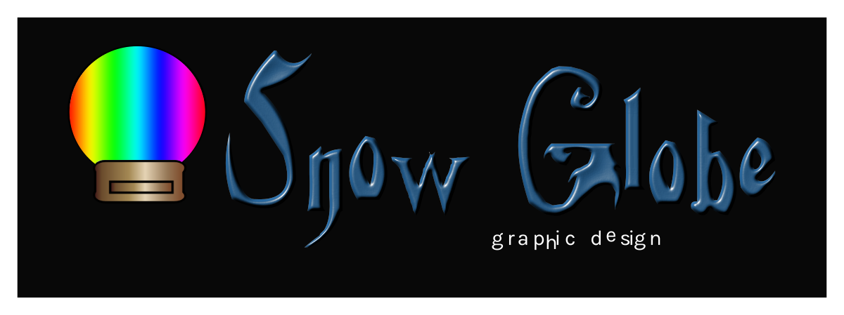
I don't have to tell you what's wrong with bevels in digital graphics… but I will anyway: it's ugly. The trend today is flat and simple with a lot of whitespace. God forbid a trend ever forms around the bevel effect. Let's bevel all the text.
Bad Alignment
If your alignment is uneven (as in throwing objects into your graphic without aligning them at all), then you should probably align yourself to a rocket and fly into the sun… unless you're making the ugliest logo ever. Okay, that was a bit harsh. Anyway, alignment-be-gone!
Clipart
More like anti-art, am I right? Perfect. We need to replace that handcrafted beauty of a symbol with clipart unworthy enough to be its replacement.
Awful gradients
Rainbow gradients will make anyone sick. It is absolutely necessary to create the ugliest logo ever. It's time to taste the rainbow. This logo is going to be sick. Take that as you will.
Drop Shadow
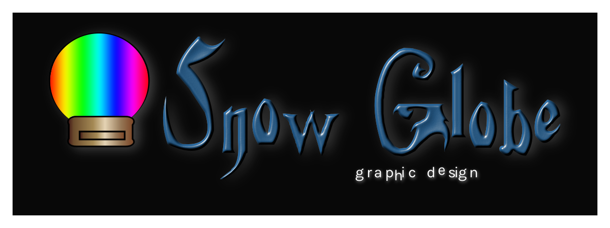
What logo actually needs a shadow? Ours does! Not that there's anything necessarily wrong with shadows but there is definitely a wrong way to use them. This is how.
Bordered Text
A border around text is a bold move. One that is hard to pull off without looking stupid. Luckily for us, it is much easier to make a border that looks absolutely terrible. Bring on the border! Except on the Snow Globe text. We wouldn't want to take away from that horrific bevel.
Free Stock Textures
There's a reason that a lot of stock textures are free: so we can use as many of them as possible for the worst logo man has ever seen. Let's get the lowest quality stock textures and apply them all directly as an overlay to the graphic.
Distortion
Since we have a cage transform tool in most photo manipulating programs, why not abuse it? Why not skew the logo too? Even better, let's rescale the image disproportionately!
Low Quality
Woah now! Our logo is way too high of quality. We need to scale this down. As a good measure, we should also use a format with lossy compression, like JPEG (or even worse, GIF!) and set the quality relatively low. Let's also set chroma subsampling to 4:2:0! That will make our rainbow gradient a horrible, pixelated mess. Stunning! In the most awful way.
Now there are many ways to ruin a design but the ones I've mentioned probably take the cake. The use of any of the techniques above is a sin. Not to be overly dramatic but you will be damned to Hell for using any of them in 2015… or at all. If you enjoyed watching me ruin a decent logo, share this post with your friends with the caption “Inspiration for your next project.” That was a joke. Don't do that. Without further ado, it's time for a before-and-after shot.
Just look at the destruction we've caused.
